Monique writes:
"Is there anyway in your pen stroke technique to give the picture a smoother feel like some of your paintings and drawings have?
I notice that smoothness in Ned Smiths work very appealing, although I don't think I've seen any pen and ink."
As I'm sure you're well aware of, drawing with ink has an almost totally different application process than say painting, or drawing with graphite.
The nature of ink is to be raw, rather rough-edged, and bold. That's not to say you can't achieve smoothness, but if I'm going to go for a totally smooth look in black and white art, I'd just use graphite and white tempera on a middle-toned drawing board.
It IS possible to get a "smooth" look with pen and ink if a) it's the look your going for, and b) if you have a lot of time on your hands. One way to do this is with an ink wash, which I eventually would like to try. There are troubles with that though as well, and I'm not garunteed to like the result, because again, I prefer it to look drawn, rather than painted. I think a "wash" would be too solid of a background shading style to go along with the sketchiness of the actual subject.(I don't have a good feeling about ink washes, but I'll give it a go sometime soon to see if it helps.) Essentially ink can be very scribbly, and sketchy, or fine-tuned, and smooth.
For me, ink is not only convenient, but it has raw appeal. What drew me to it [no pun intended] to begin with was the boldness, and the usage of lines to create different "textures", and depth. I mean, in the real world, lines are non existant. Whereas with painting, and shading with graphite your goal is to create depth with tones, and values, INK forces you to use line a lot more, and come up with creative ways of creating shades, outlines and depth.
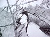
Click on a thumbnail of part of my Blue Jay drawing to see the hatching direction of the mountains in the background, and the tree branches in the middleground:
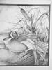
With my Blue-Winged Teal illustration, I used stippling (dots of ink) to create the illusion of clouds in the background:
So yeah...I suppose it is possible to create "smooth" ink drawings, if you want to.
I don't consider Ned's ink illustrations to be smooth at all. In fact, most of what I've learned about ink illustration has been absorbed from admiring Ned's flowing ink drawings since I was a little boy.
That said, the posted image of the blue jay you see is unfinnished. I finnished it yesterday, so perhaps I should post the updated version for critique. I REALLY appriciate input from other artists, so THANK YOU very much!!


|